Flinders University
LOGO Refresh
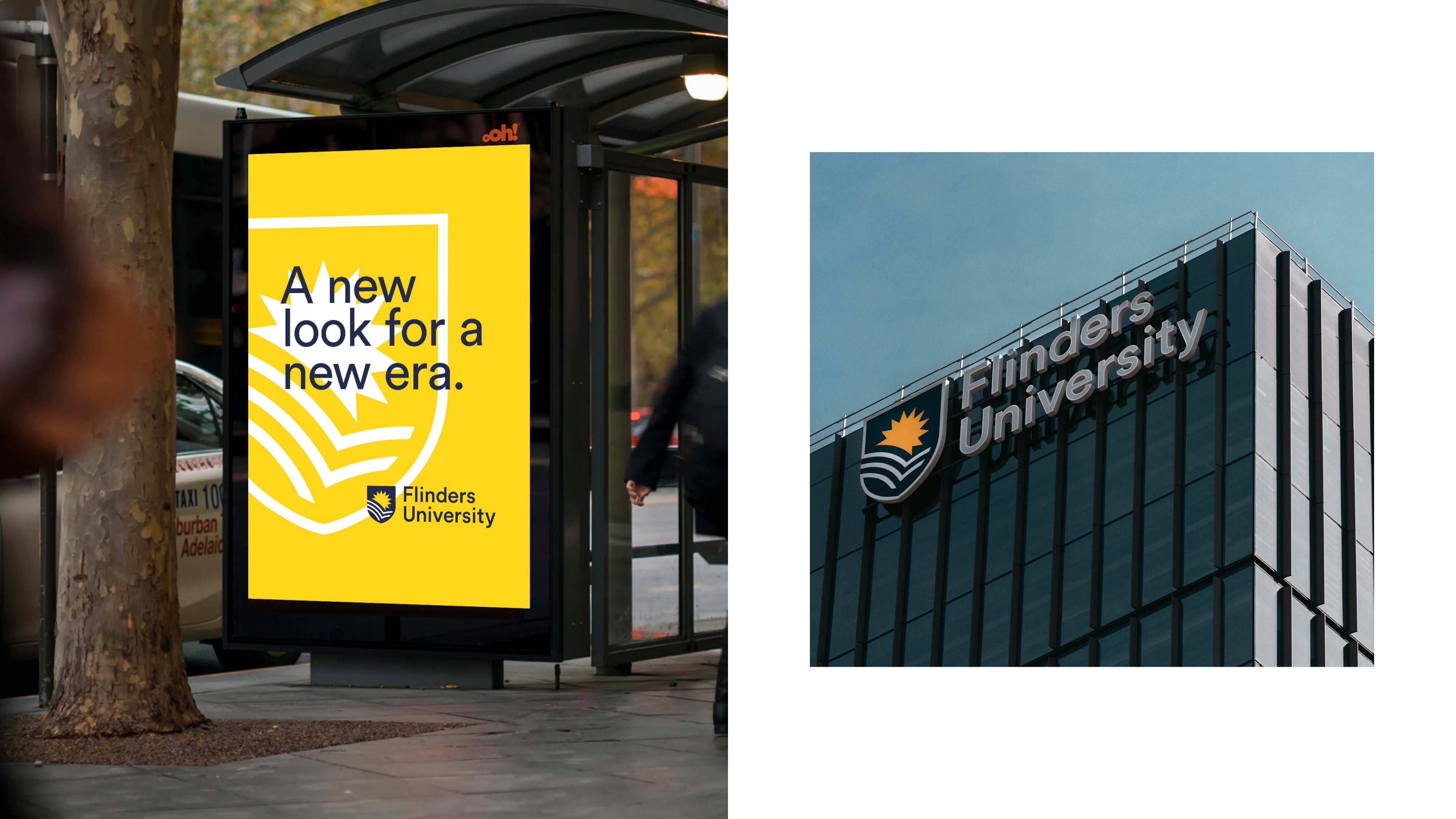
Flinders University is an institution that has constantly adapted and evolved, remaining at the forefront of advances in education and research. As part of a university-wide brand refresh, Flinders looked to refresh their logo, ensuring it reflected the ethos of the institution, was inclusive to all audiences, and could work across varied applications required in a digital-first world.
Throughout the extensive design development, Showpony led a comprehensive consultation process, spanning over 18 months. In addition to the collaborative and iterative design exploration, our role included stakeholder and cultural engagement, along with navigating and responding to key audience testing across current and prospective students, international audiences, staff and alumni.
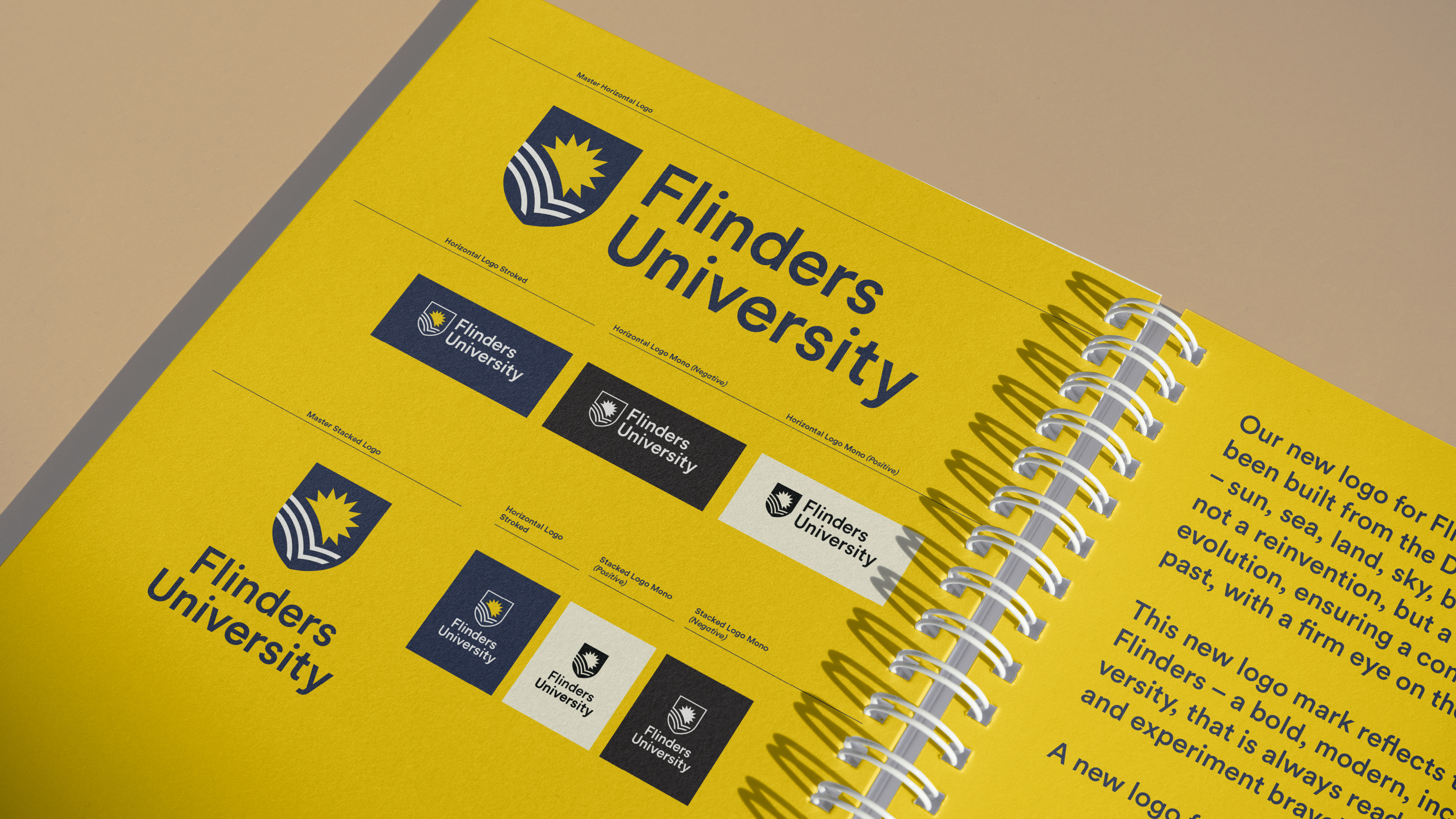
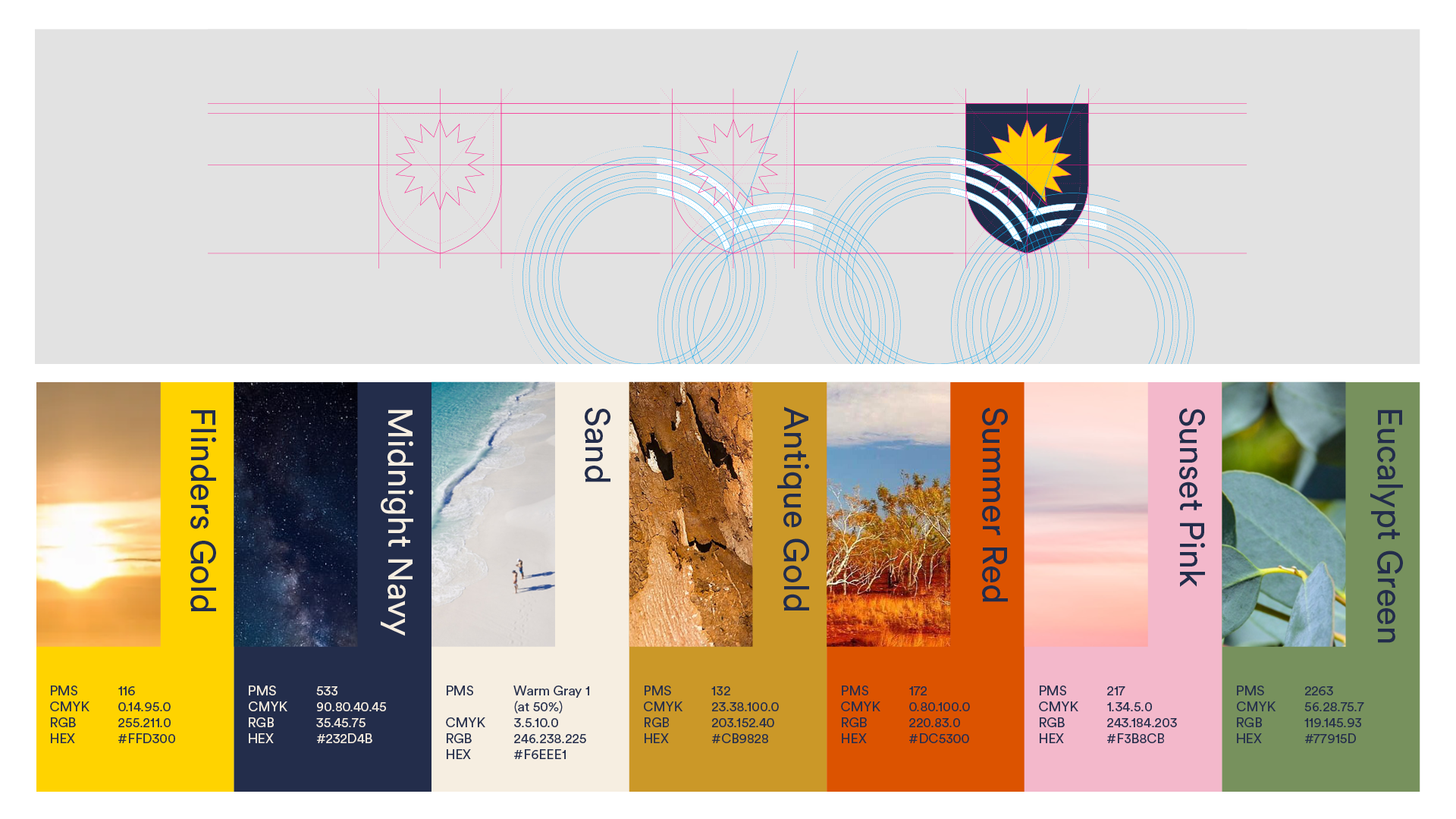
The new logo has been built from the DNA of the old – sun, sea, land, sky, book and shield. It is not a reinvention, but a reimagination and evolution, ensuring a connection to their past, with a firm eye on the future.
While honouring Flinders’ history and values, the new logo captures the institution’s strengths as a modern, innovative, inclusive and student- centred organisation. It signifies a bold, welcoming and dynamic university that continues to experiment and experiment bravely.