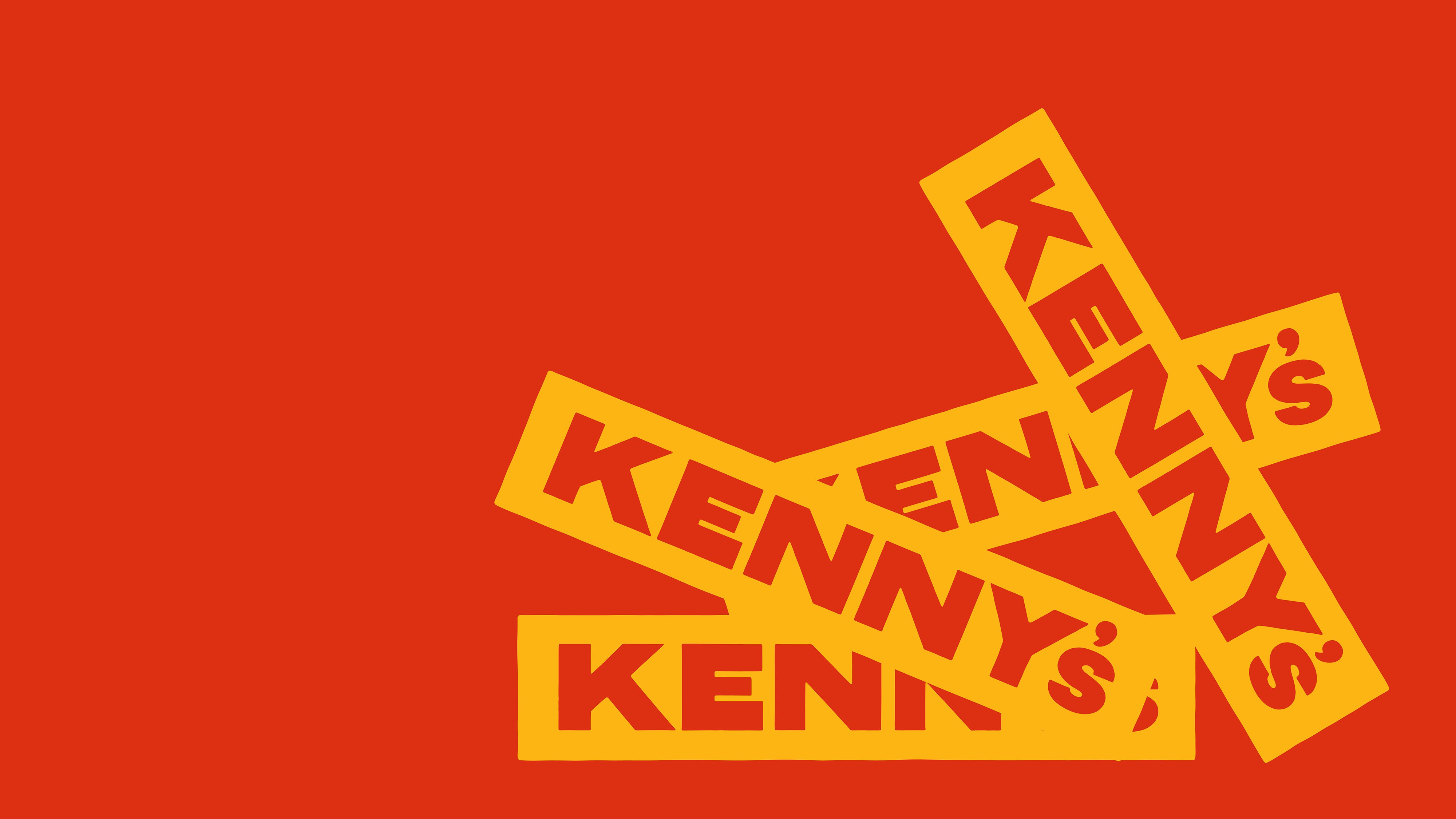
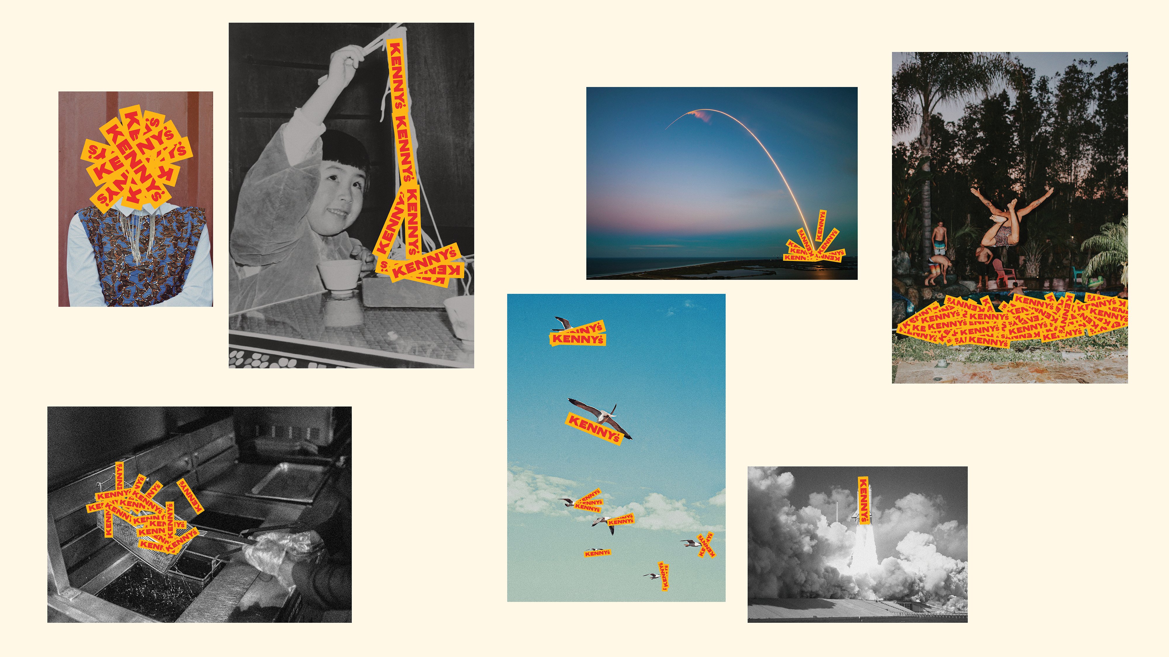
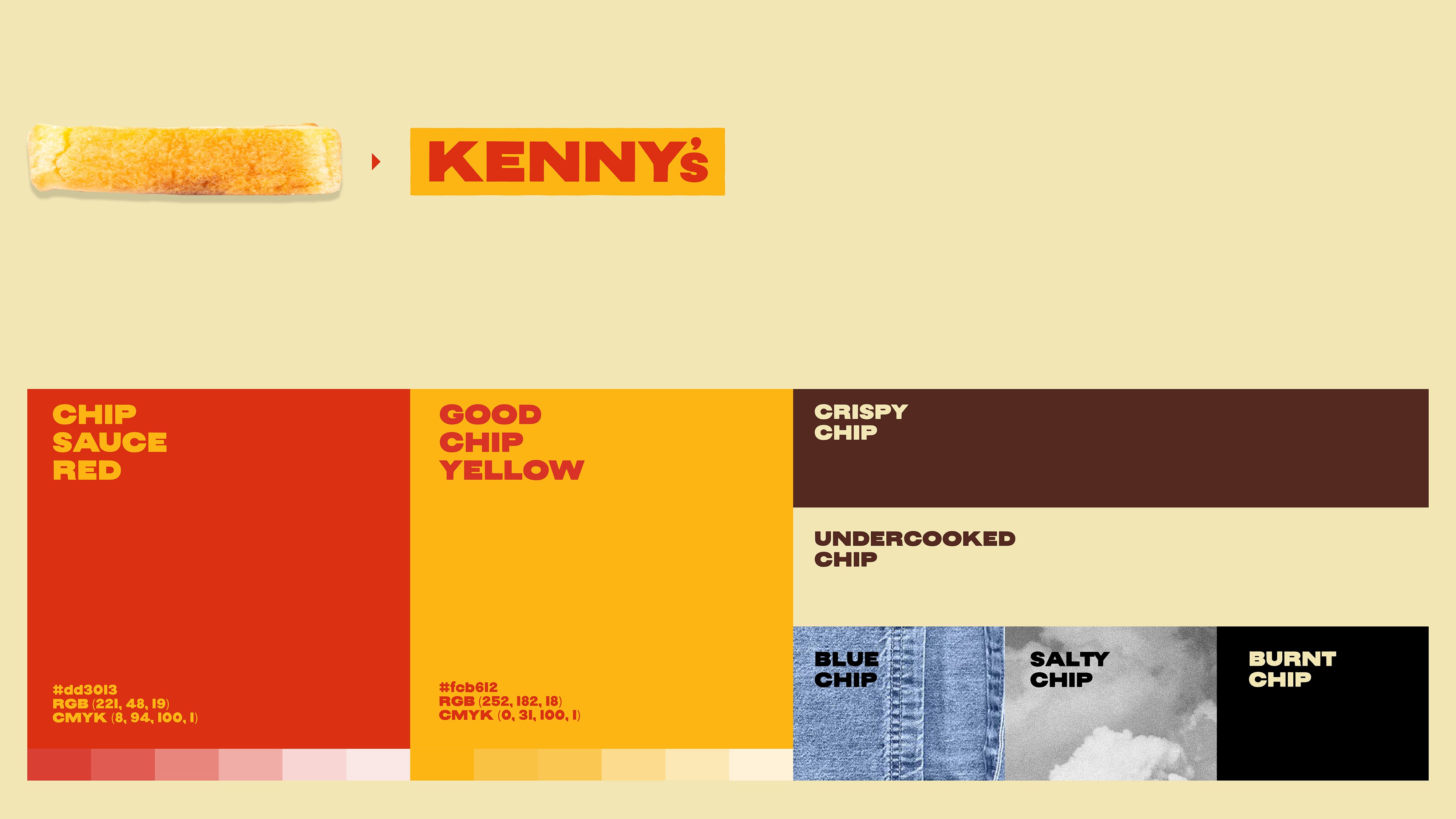
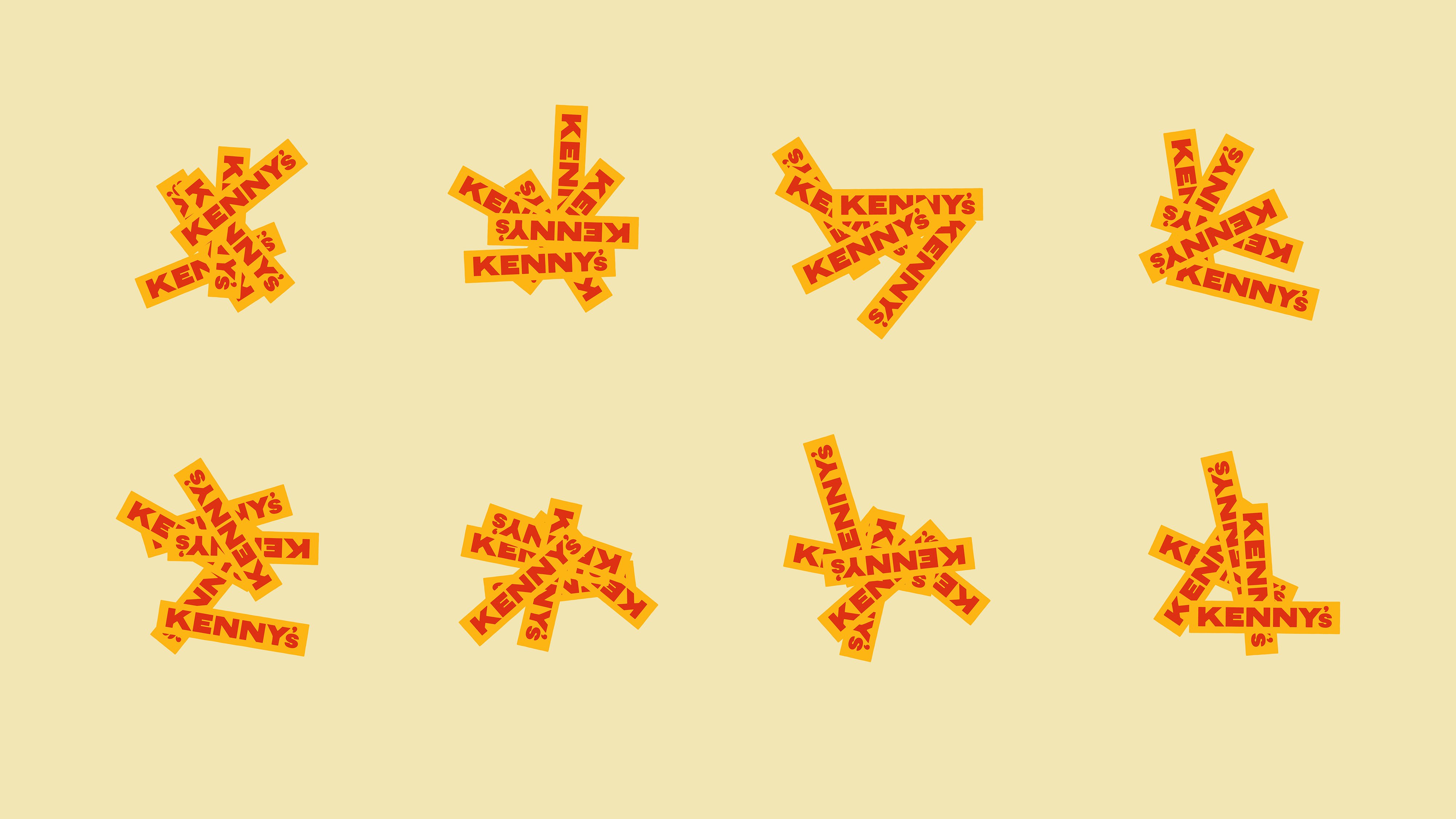
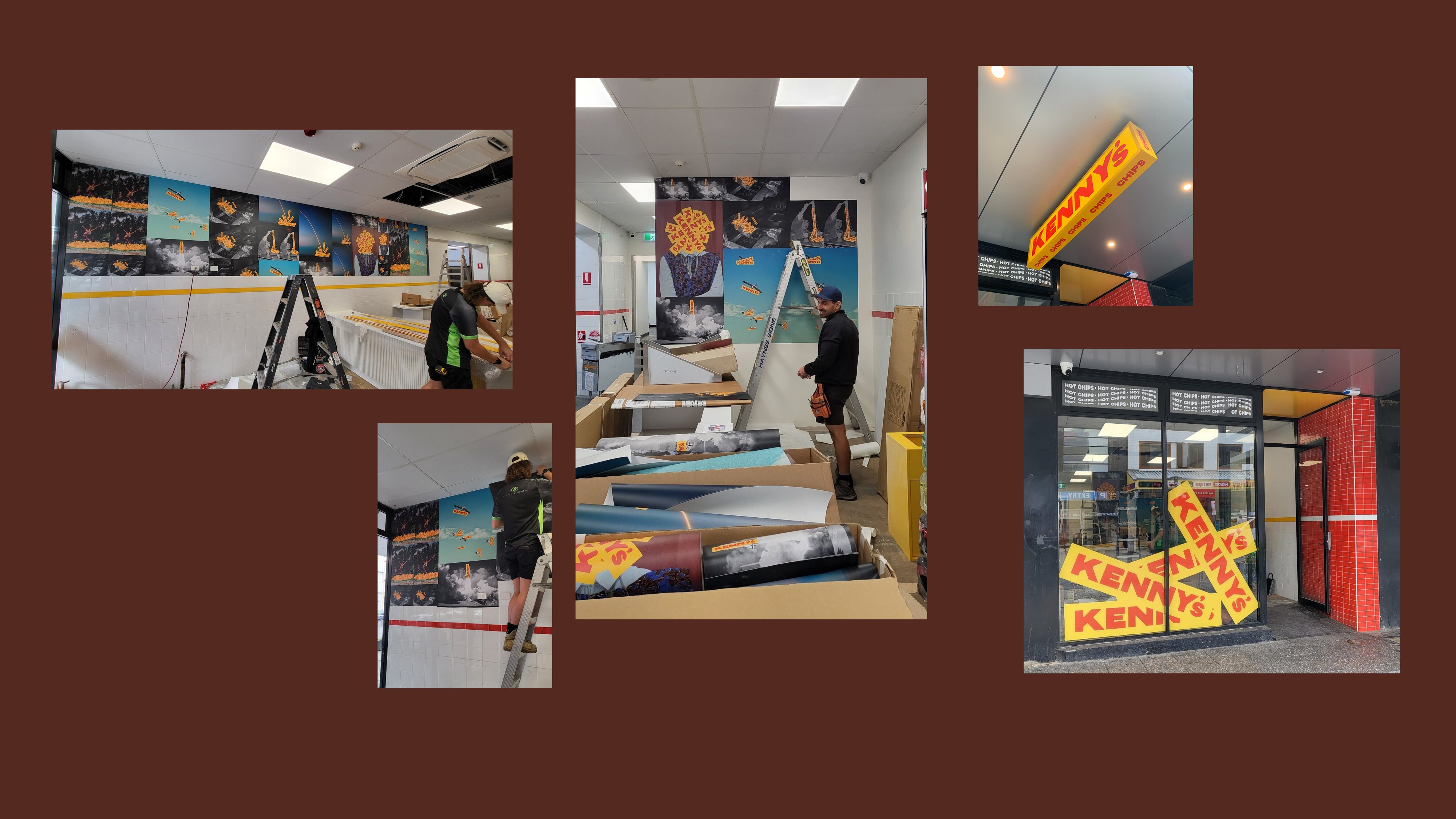
Kenny’s is a new fast food restaurant with a difference – they just make chips. Really well. So in developing their visual ID, we thought, why complicate it? Let’s just make the brand out of chips too. So we made a logo that looked like a chip, and slapped it on everything. We added some chip-derived colours too. Because everything is better with chips. Sure, it was nothing fancy, but like a bowl of hot chips, it was totally satisfying, and really, really tasty.